All posts by admin

Portfolio Blog Post 1: Audience and Content Relationship

Public history is a heavily contested practice in the history profession, mostly on what the practice truly is. According to John Dichtl and Robert B. Townsend, in their article “A Picture of Public History: Preliminary Results from the 2008 Survey of Public History Professionals” (2009), state, “Public history is one of the least understood areas of professional practice in history because the majority of public history jobs are outside of academia . . . One of the most significant challenges for public history as a field is ambiguity about the definition of the term.” (Dichtl and Townsend). Historians have had difficulty understanding the purposes of public history. While there are debates about the practice, one aspect remains true: the combined effort of historians and the public. In his article, “Whose Public? What is the Goal of a Public Historian?” (1981), Ronald J. Grele states, “But such work has always combined a commitment to one’s own research and a commitment to helping people do their own history, to involve themselves in their pasts, to increase their historical consciousness.” (Grele, 47). Historians work with the public to create projects that fit their needs. Public history projects following this model have implemented cooperation in different ways.

            Understanding the public and shared authority are some of the main goals of historians working in public history. Serge Noiret, in his article “Sharing a Public Historian’s Authority within Communities” (2022), explains, “A long time practitioner of these shared authority practices in community projects in the UK, Paul Ward, tells us that ‘community research […], consistently seeks to sustain our community, revitalize and return our people back to their culture and language.’” (Noiret, 51). Historians should research the public to understand the community’s needs better and create better projects. One of the ways to do this is to interview people. According to Erika Hall, in her guide to “Interviewing Humans” (2013), “The goal of interviewing users is to learn about everything that might influence how the users might use what you’re creating.” (Hall). Different projects have implemented this strategy to help create and design to fit users’ needs better. One such project is the “Building Histories of the National Mall” (2015). The project creators used interviews to gauge what users wanted from the website, stating, “These findings guided the development and refinement of the Explorations section, and also guided the content team on where to focus research and writing time.” (Brennan and Leon, 25). Interviews are one way that historians can create projects with shared authority. Personas are also a way historians gauge users’ needs. Shlomo Goltz, in his article “A Closer Look at Personas: What They Are and How They Work” (2014), explains, “A persona is a way to model, summarize and communicate research about people who have been observed or researched in some way . . . Personas aid designers to create different designs for different kinds of people and to design for a specific somebody, rather than a generic everybody.” (Goltz). Historians use personas to help fit all potential users’ needs and understand the community. Both interviews and personas help historians and the public work together in a shared authority to create projects that fit the community’s needs.

User Research Findings

Researching how different companies use personas to gauge who may or may not be their audience made me think differently about the website I am creating and who might be a user. According to Shlomo Goltz, in his article “A Closer Look at Personas: What They Are and How They Work,” states, “A persona is a way to model, summarize and communicate research about people who have been observed or researched in some way . . . Each persona represents a significant portion of people in the real world and enables the designer to focus on a manageable and memorable cast of characters, instead of focusing on thousands of individuals.” (Goltz, “A Closer Look at Personas). According to Goltz, personas are a way for someone to narrow down and focus on the different traits of people rather than a generalized public. Before looking at personas, while I thought I was narrowing my primary and secondary audiences down to more descriptive characteristics, I was not looking at the bigger picture. For example, for my project, I stated that my primary audience includes everyday American tourists of national parks or memorials with at least a high school education. However, that was not as narrow as I thought. After reading about personas, I did not consider why people visit these places, what they might have been interested in school, or their degrees. I also did not consider the people who necessarily do not visit these places. According to the WOSP Personas, some people visit, occasionally visit, or do not visit at all. Different audiences should be considered when designing a project to incorporate ways that might make them users. (WOSP Personas).

The Pew Research Center’s research on internet, mobile, and social media use has also made me reconsider who and what my focus is on. According to the Center, mobile use plays a big part in peoples’ everyday lives. The Center states, “Mobile devices have changed the way people think about how and when they can communicate and gather information by making just-in-time and real-time encounters possible. They have also affected the way people allocate their time and attention.” (Pew Research Center, “Three Technology Revolutions”). The last line made me think about how I need to design my project to make it a website for people who want to “allocate their time and attention.” According to the Pew Research Center, social media use has risen in the past years, stating, “The rise of social media and social networking has affected the way that people think about their friends, acquaintances, and even strangers . . . One of the major impacts was that the traditional boundaries between private and public, between home and work, between being a consumer of information and producer of it were blurred.” (Pew Research Center, “Three Technology Revolutions). Again, the last part struck me. For my project, I plan on making the website collaborative. With this new information from the Center, I see that social media can be used for people to be a “producer” of information for the project.

Physical/Digital Site Comparative Review

Many Voices, One Nation: National Museum of American History, Washington, D.C.

The National Museum of American History in Washington, D.C., is home to many artifacts and items connected to the vast history of the United States. These items tell various stories involving different disciplines of history from military, popular culture, and societal. One exhibit, Many Voices, One Nation, falls under the latter two, telling the stories of the long history of immigration in the United States.

Physical Site

Argument

When visitors walk into the exhibit, they are greeted by the title with some information about it. It states:

The people of North America came from many cultures and spoke different languages long before the founding of the United States, even before European contact. In creating the new nation, early leaders envisioned a country that promised opportunity and freedom—but only for some. As the population grew, the people who lived in the United States found ways to negotiate, or work out, what it meant to be American. That negotiation continues. This exhibition explores how the many voices of people in America have shaped our nation.1

The argument the exhibit is trying to convey is that the United States is a country of diversity and the contributions that different “voices” have made throughout its history. The exhibit does well in communicating that argument with the items relating to other cultures in the country and spanning from the earliest days to today.

Audience

The audience for the exhibit is tourists in Washington, D.C. Being a part of the Smithsonian Institution, the exhibit is free for anyone to see, making it relatively accessible for tourists in the area. Being a short walk from the Metro also gives residents and tourists access. The museums are also favorite spots for field trips for K-12 schools, giving young students access to the exhibit. Other audiences include anyone interested in immigration history in the United States, whether a researcher or the average citizen.

Content

The exhibit contains several items that relate to the argument it is trying to make. The items are divided into different categories that all tell an overarching history of the United States. These categories include religious groups (specifically Catholicism and Judaism), education, sports, and achievements. The items range from statues and different objects to painted items such as the Painted Elk Hide from between 1693 and 1710. There is not one item or items that weigh more heavily than the others. The exhibit shows the importance of all the items equally.

Layout

When visitors first walk into the exhibit, they see the earliest items in history conveyed. However, the traffic flow changes once they turn the corner, giving visitors different options to view the items. It also makes viewing the exhibit easier, especially on busier days, ensuring more traffic flows freely rather than a single flow.

Interactivity

The exhibit contains some forms of interactivity with metal booklets showing topics related to the items presented behind them and touch screens with more information.

Curators, Interpreters, and Docents

There are employees stationed at the exhibit to give more information. However, they are regulated to the front of the exhibit at a desk rather than inside, and when I viewed the exhibit, there were few visitors for them to interact with. The only employees present inside the exhibit consist of security guards.

What I Would Change

Some things would make the exhibit more effective. For one, I would add more interactivity for visitors. Most of the exhibit consists of visitors viewing items and reading the information provided. Adding more ways for visitors to interact would give the items and history more meaning. I would also add a way for visitors to contribute. At the Civil Rights Museum in Montgomery, Alabama, there is a section at the end for visitors to add their names and thoughts about the museum and the country’s civil rights history. The museum provided a touch screen to input information, and once that was entered, it showed up on a screen that covered one wall of the room. Adding an element similar to that in the Many Voices, One Nation exhibit would allow visitors to provide their thoughts or even their stories, which can open up a conversation in that history.

The only other thing I would change is more employee interaction. However, since I visited on a slower day, there was less interaction compared to the interactions employees give on busier days.

Digital Site: https://wayback.archive-it.org/3340/20230921075831/https://americanhistory.si.edu/many-voices-exhibition

Unfortunately, the National Museum of American History is changing its website layout, including the separate websites for the exhibits. However, the museum did archive most of its previous site pages using the Wayback Archive, making it accessible to users.

Argument

The website’s argument is the same as the physical site’s, conveying that the United States is a country of diversity and the contributions that different “voices” have made throughout history.

Audience

While the physical site focuses on tourists, the website is primarily for people who need help to make it to Washington, D.C., to see the items. There is also more of a focus for researchers than the physical site, giving more reliable access than a physical site would provide, especially to researchers who cannot visit.

Layout

The website’s layout has a main page giving users some introductory information about the exhibit. It is then divided into sections spanning the history of immigration in the United States with subsections within those sections. It is more free-flowing than the physical site, as users can access whichever section they want to read. An “About” section also gives more information about the exhibit and the donors who contributed.

Content

The information provided in the sections and their subsections is similar to the physical site’s, with information about the different periods, the topics during those periods, and the items included in the exhibit.

Interactivity

There are some interactive elements on the website. Pictures of the items are provided. However, there is no ability to view the record now, and some pictures still need to be included in the website archiving. One of the sections consists of a short video explaining the period, while the other sections only have a short paragraph.

Site’s Creators

Unfortunately, there is no way for users to contact the site’s creators other than getting the museum. There are two different ways for people to contact the museum: email and by phone. It also provides an FAQ page. The contact information can be found at https://americanhistory.si.edu/about/contact. There is also a way to contact the museum’s web team with any questions about the changes happening to the website which can be accessed at https://americanhistory.si.edu/nmah-web-team/contact.

What I Would Change

There are some changes I would make to make the website more effective for users. Just like with the physical site, I would include more interactive elements. This would consist of a way for people to share their thoughts or contribute their stories about immigration. Like the physical site, this would open up a conversation about immigration history in the United States. I would also provide a way for users to contact the creators. By doing some research, I found that the exhibit was produced by Haley Sharpe Design, and some information about their role is provided here. However, I needed help finding out who was responsible for creating the exhibit in the museum. Providing that information would allow users to converse and learn more about different items and elements of the exhibit with the creator/creators. Nonetheless, this is only an archived website. All of these elements might be addressed in the new website that is under construction. Returning to that site once it is completed and comparing it to the original site would be interesting.

  1. Many Voices, One Nation. Exhibit. National Museum of American History. ↩︎

Introductory Blog Post

Hi, my name is Audrey Schroeder, and I am a graduate student working towards a Master’s in history. This is my second semester in the program at George Mason. Before this program, I received my Bachelor’s in history at the University of Mary Washington. I tend to focus on popular culture and World War II in American history. Before I chose history as my major, I was initially working towards teaching in Early Childhood Education. My background in digital humanities at the moment is limited. My research, in general, takes advantage of digital sources. For example, my senior thesis at Mary Washington was on Hollywood movies used as propaganda during World War II, which required me to find and watch said movies. I also made use of individuals involved during that time. I also had an assignment in one of my classes requiring me to record the metadata for a document in an archive for the school. So far, at George Mason, I took Intro to Digital Humanities last semester, which I enjoyed. I decided to include the certificate along with my major because my ultimate goal is to work in a museum setting one day. Since digital exhibits are becoming more of the norm, learning how to create them would be beneficial. My goal for this semester is to learn how to create accessible digital exhibits for the public.

(Re)Defining Digital Humanities

Through this course, my definition of Digital Humanities has changed significantly. Looking back at my original definition, it seems plain, almost like a basic textbook definition of the topic. There is so much that I would change in the original. One of the first things I noticed while reading through it was that I note digital tools without giving examples. In my new definition, I detail a few of the tools I learned in the course and how they are used in Digital Humanities. For instance, I would mention the text-mining tool Voyant and how historians use it to find trends and patterns within their source material. I would also include how historians have used digital analysis and research. One example would be crowdsourcing projects that encourage people to volunteer to help transcribe documents into a digital archive or podcasts that involve people in a historical story.

I would keep the original definition but tweak it slightly. My original definition was, “Digital Humanities is a field of study in which different disciplines work to analyze, archive, and preserve historical material in the digital medium.” While I still believe that to be true, I would add to it. I would include, along with different disciplines, that historians involve the public in projects and have similarities and connections to public history. I would also include using various tools to analyze, archive, and preserve in different projects. I still believe that my original definition holds. However, my view of Digital Humanities has broadened to see that there is much to offer in the field.

Podcasts & the digital humanities

Humanities scholars have analyzed sources and moments in history in various ways. Many conduct research through the traditional means of reading and analyzing sources and even delve into the digital world through different tools, including maps, graphs, and text mining. However, there is a reasonably recent medium that humanities scholars have begun to use to analyze and research: podcasts. Podcasts have become a viral medium for people to consume different topics. According to the Pew Research Center, “Roughly half of U.S. adults say they have listened to a podcast in the past year . . . including one-in-five who report listening to podcasts at least a few times a week. Among adults under 30, about a third listen to podcasts with such frequency.” (Pew Research Center, Podcasts as a Source of News and Information, 2) With it being a popular medium for people to use, historians have begun to use podcasts to exhibit their research.

There are many different reasons why historians have stepped their toes into the Podcast medium. One reason is that it vastly differs from other modes of research and analysis. Liz Covart, in her article History Podcasts: An Overview of the Field (2022), states, “Podcasts serve as the perfect medium for our mobile, digital age. They are downloadable and streamable audio files that you can listen to whenever and wherever you want. They provide convenience.” (Covart, History Podcasts: An Overview of the Field, 221) Podcasts are a way for historians to reach a wider audience than they would have with traditional means. They are also a form for historians to connect with other people. Covart explains, “When riders and drivers listen through the sound systems in their cars, they invite podcast hosts to keep them company on their trip. Given the human need for stories and connection, podcasts humanize stories in a powerful way unique to the medium. The intimacy, oral storytelling, and this power to humanize make podcasts an effective tool for historians to convey the past.” (Covart, 221) Podcasts connect people to the hosts and the stories they tell, and historians have turned to this medium in the hopes of the same connections to history.

While podcasts are vastly different from traditional and even some other digital modes of research and exhibiting, they share some similarities, too. One of the things that I noticed between podcasts and other digital tools is that they are all new ways to analyze and present data. When someone listens to a history podcast, they go into the host’s mind and connect to the story that the host wants to tell. This is not different from other digital tools. For example, when a historian makes an exhibit using Omeka and text mining tools like Voyant, they want the audience to connect with what they see rather than listen like with a podcast. All of these digital tools together change the way that research is done. In his keynote at the Sound Education conference, Dan Cohen states, “We can take some helpful clues about this situation from other new media formats that have flourished on the web over the past quarter-century. For instance, since the advent of the web, and its ability to serve a wide array of text, in difference lengths, sizes, and contexts, we have seen the birth of new genres that challenge traditional writing and break out of the constraints of print publication.” (Cohen, Sound Education) Podcasts and other digital tools are making waves in how historians analyze and research different material.

What Can Digital Humanities Do With Crowdsourcing?

Crowdsourcing is how historians in the Digital Humanities field can create projects that create new ways of analyzing material. Collaborators to The Collective Wisdom Handbook state, “Crowdsourcing can open up new possibilities for research that could not have existed otherwise, fundamentally changing authoritative practices, definitions, and classifications.” (The Collective Wisdom 2) Along with changing the way one analyzes data, there is a component of collaboration. The collaborators on The Collective Wisdom Handbook explain, “At its best, crowdsourcing increases public access to cultural heritage collections while inviting the public to engage deeply with these materials.” (The Collective Wisdom 3) The publics’ collaboration with these projects is one of the main components crowdsourcing. These projects come about in many different ways and what tasks the public undertakes. One of the best examples of these different tasks is transcription.

Transcription in crowdsourcing projects puts the task directly into the public’s hands. The project creators upload documents and ask volunteers to help transcribe them for an online archive. One of the first projects to bring this idea forward was Transcribe Bentham. The Transcribe Bentham project uses documents created by philosopher Jeremy Bentham “with the intention of engaging the public with Bentham’s thought and works, creating a searchable digital repository of the collection, and quickening the pace of transcription and publication by recruiting unpaid online volunteers to assist in transcribing the remaining manuscripts.” (Causer, Tonra, and Wallace, Transcription maximized, 120) The project aims to have volunteers transcribe the documents that creators upload in a collaborative effort to build an archive of Bentham’s documents.

Another project that uses transcription in a crowdsourcing project is By the People. By the People is a project created by the Library of Congress, designed similarly to Transcribe Bentham, that encourages volunteers to help transcribe documents uploaded to create an archive. The documents in this project vary widely “into ‘Campaigns’ and presented to volunteers along with transcription conventions, a discussion platform, and explanatory material to help folks learn a bit about the subjects of the documents.” (Hyning and Jones, Data’s Destinations, 9) This learning of the material is how these projects keep participants engaged in transcribing the documents. With Transcribe Bentham, the creators discovered that volunteers “were motivated by a sense of contributing to the greater good by contributing to the production of the Collected Works and making available Bentham’s writings to others, whereas some even found transcribing fun.” (Causer, Tonra, and Wallace, Transcription maximized, 127) To keep volunteers excited and engaged to transcribing the material, they need to feel like they play a significant factor in the process and it has to be fun.

How to Read Crowdsourced Knowledge

Wikipedia has gained a reputation since its inception in 2001. To this day most educational spaces treat the website as taboo, a website filled with errors that users should avoid at all costs. Alexandria Lockett, in her article “Why Do I Have Authority to Edit the Page? The Politics of User Agency and Participation on Wikipedia” (2020), states, “Wikipedia was clearly shaking up the education system back then, and it continues to be taught as a forbidden space. Throughout my undergraduate studies, my peers and I noticed and discussed that our professors were increasingly issuing threats and warnings about using and citing Wikipedia.” (208) Despite those threats, students, and others, continue to use the website for information on various topics. Roy Rosenzweig, in his article, “Can History Be Open Source? Wikipedia and the Future of the Past” (2006), believes this can be a good thing for educational and historical purposes. He states, “One reason professional historians need to pay attention to Wikipedia is because our students do . . . We should not view this prospect with undue alarm. Wikipedia for the most part gets its facts right . . . And the general panic about students’ use of Internet sources is overblown.” (136) As Rosenzweig implies, Wikipedia can be great for beginning research for students and historians—one reason is their Talk and History pages.

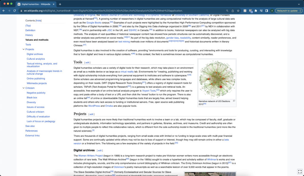
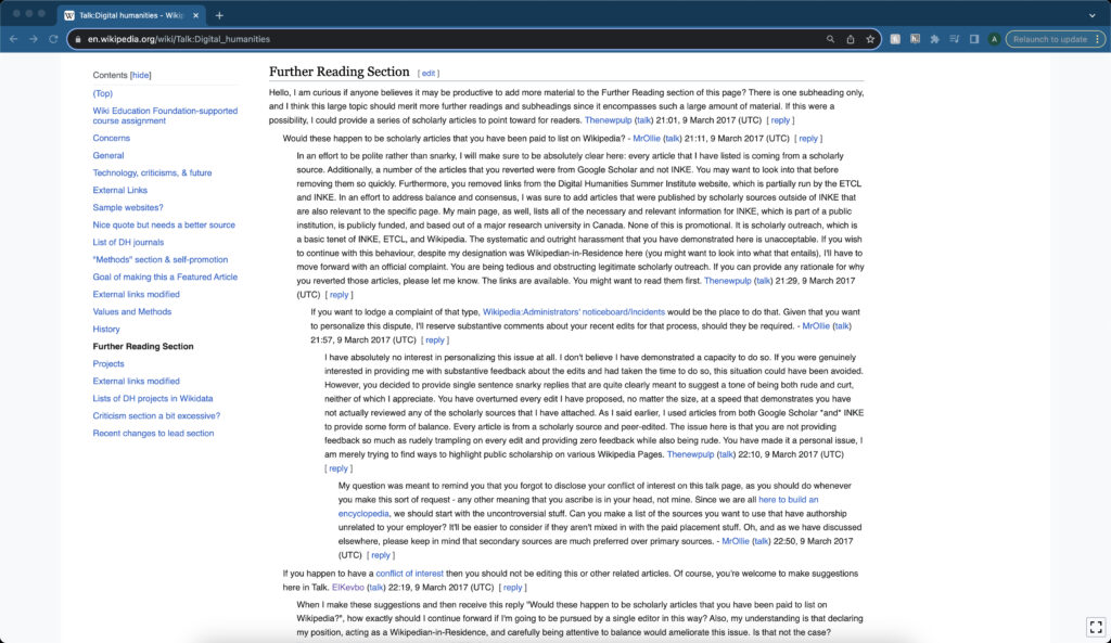
The Talk page on a Wikipedia article is a section where users can bring up concerns, potential edits, or any other topics they feel are essential for the article. This section can give users a sense of how the article has changed over time and what different contributors see as the critical issues and concerns of that article. When I looked at the Talk section for the “Digital Humanities,” I noticed that there were different concerns with the organization, particularly with the references and sources.

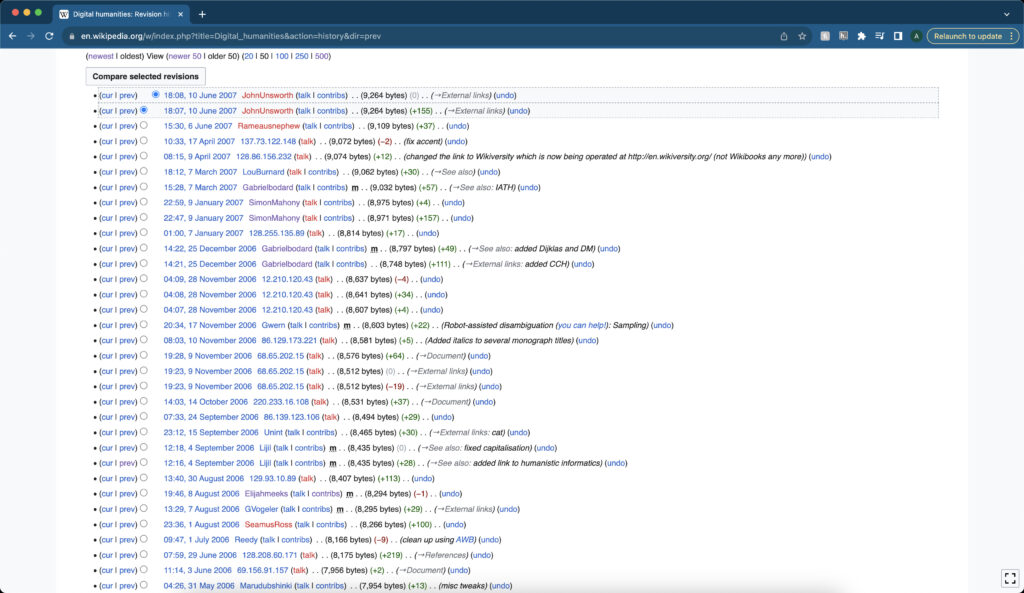
This attention to the sources tells me there is a concern with the contributors about where the information comes from and that the information is most likely accurate. This conclusion lines up when I looked at the History page for the article. The History page for a Wikipedia article gives every single time a revision took place for a particular article. It gives the user who revised the article, the edit size, and when the edit took place

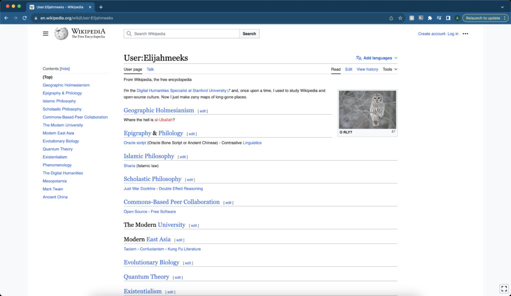
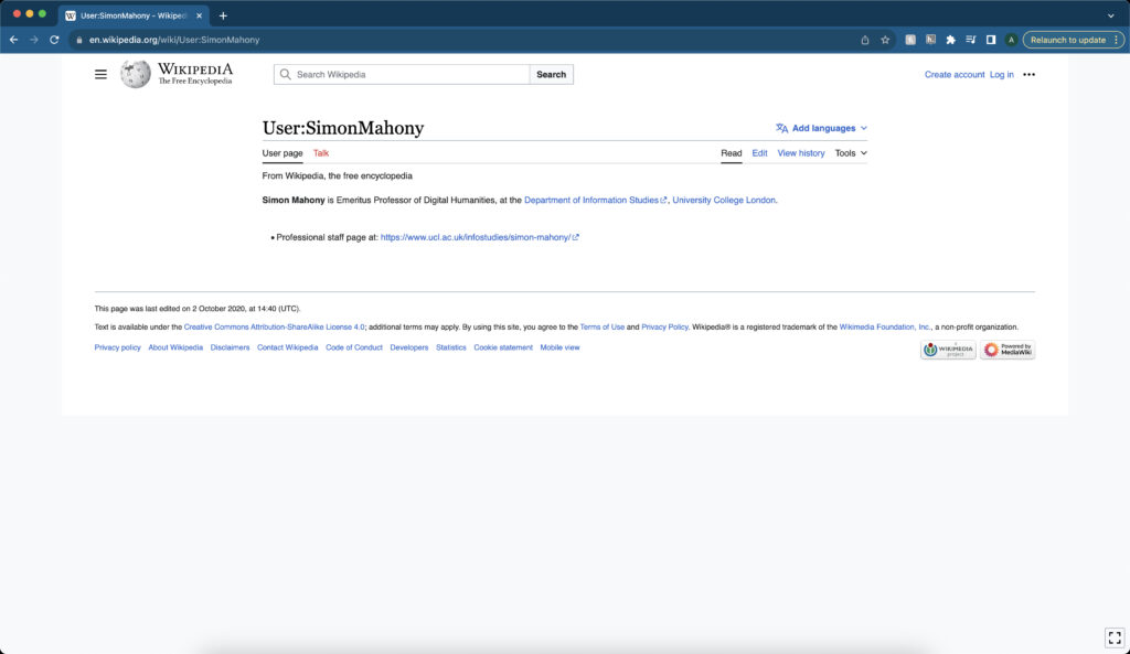
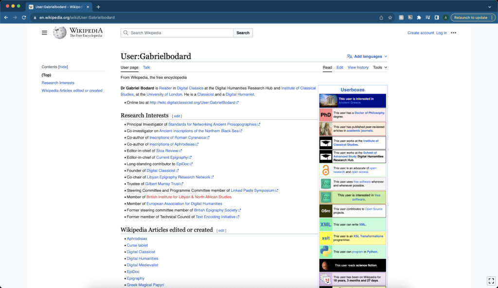
When I looked at the page, I noticed three contributors significantly changed to the article: Elijahmeeks, Gabrielbodard, and SimonMahony. I decided to click on their names to learn more about them, and I found that they were all associated with the Digital Humanities in some capacity. This association lines up with the Talk page and the concerns about sources. People associated with the Digital Humanities field will be concerned about where the information is coming from and if it is accurate which is why it is brought up repeatedly on the Talk page.

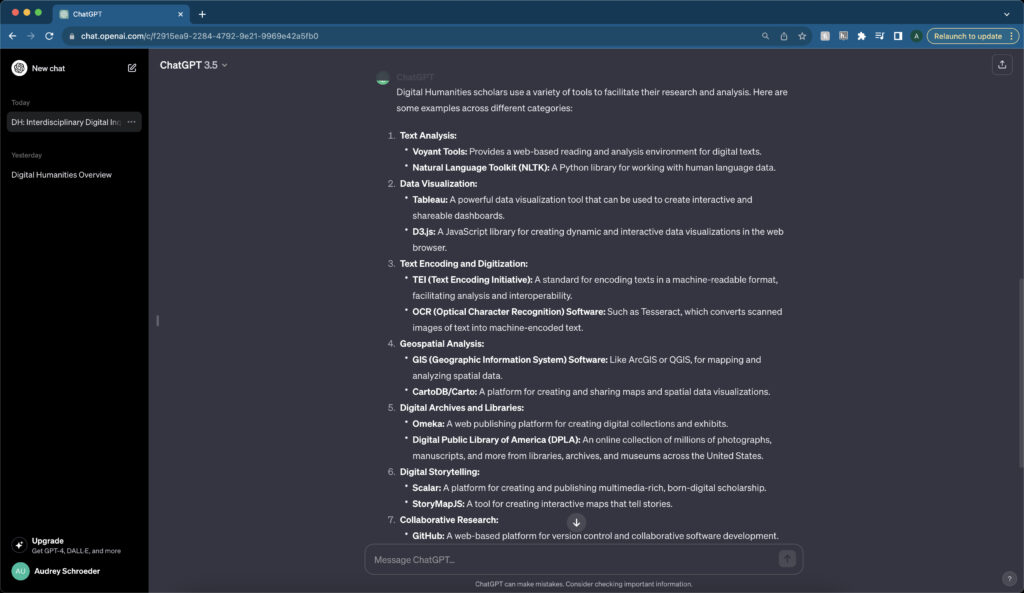
Recently, there have been concerns about using A.I. for crowdsourcing information, especially as a threat to Wikipedia. In his article “Wikipedia’s Moment of Truth” (2023), Jon Gertner states, “On a conference call in March that focused on A.I.’s threats to Wikipedia, as well as the potential benefits, the editors’ hopes contended with anxiety. While some participants seemed confident that generative A.I. tools would soon help expand Wikipedia’s articles and global reach, others worried about whether users would increasingly choose ChatGPT . . . .” (36) There are many reasons why A.I. worries experts when crowdsourcing information. When I was using ChatGPT, I noticed a lack of citations for the information the program answers with. This lack of citations shows how well Wikipedia does with crowdsourcing information since there is an emphasis on citing information. However, there are still possibilities when using A.I. When I was looking at main article for Digital Humanities on Wikipedia I noticed that the Tools section was a little light, only mentioning a few tools. When I asked ChatGPT to give me some examples of different tools, it gave me several compared to the Wikipedia article. I can see a use for ChatGPT and other A.I. programs for crowdsourcing information. Nonetheless, the problems with citations still gives Wikipedia a point in proving accuracy.

Compare Tools

The digital tools Voyant, Kepler.gl, and Palladio are handy tools for historians and researchers to use when analyzing digital material. Researchers use these tools to look at relationships within, find patterns and trends, and convey meaning and understanding from the research material. Researchers can do this because of the visualizations these three tools create making finding specific patterns easier. While the goals for why researchers use these tools are similar, the tools themselves are very different in their executions.

Voyant is a text-mining tool researchers use to convey meaning from a data set. It includes five tools researchers can use together to derive meaning from selected texts. The Cirrus tool is a word cloud that shows words that appear most frequently. Like Cirrus, the Trends tool is a graph visualization that shows the frequency of a specific word across the document. The Reader tool shows the document itself where users can select a specific word to find in the document. The Summary tool shows an overview of the specific word in terms of the document. Finally, the Contexts tool shows each time the document uses the word. These tools, used together, can find meaning in how words can tell a lot about a period, place, people, and culture.

Kepler.gl is a digital mapping tool researchers can use to discover patterns and trends across space. Even a simple point map can derive meaning from the data they are researching by showing the different relationships between those points. However, that is only part of what Kepler.gl can do with a map and data. Researchers can change the map to look at the data in different ways. Instead of points, one can change it to a cluster map to see the quantity of the data and compare them. A heat map can do the same thing, showing the density of the data. Other items can also be added, including a timeline showing how that data changed over time. All of this can give researchers more information than just traditional research.

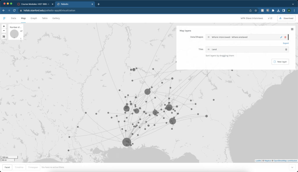
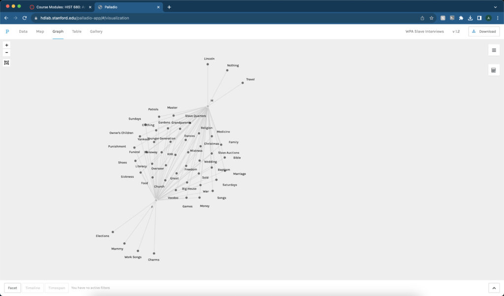
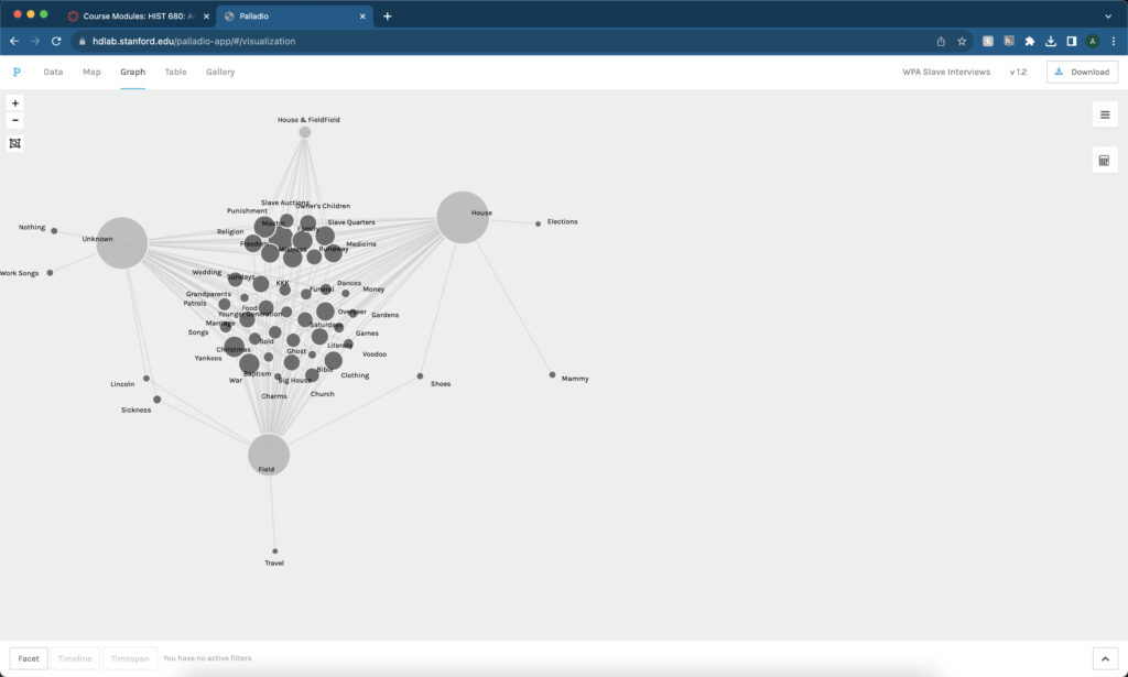
Similar to Kepler.gl, Palladio can also make use of maps in a digital medium. However, the tool’s main component is using network graphs to show the relationships between different data. These graphs, overlaid on a map, can show the connections across space. Nonetheless, some of the most helpful information comes from looking at the network graphs themselves and limiting which data is present. Limiting the data can show different connections that otherwise go unseen in traditional research or are harder to see. For example, when I worked with Palladio, I limited the information to only look at topics discussed between male and female interviewees. While both groups shared similar topics, some were limited to a particular group. These topics tell me a lot about the subjects themselves and the culture at the time of their interviews.

While these three tools have different modes of executions, researchers should look at them in a variety of ways. Researchers can use these tools together to find meaning, patterns, and trends with the material and data they choose to research. While Palladio can use maps with the network graphs, it only shows a certain amount of information. A researcher should also include using Kepler.gl to get the information one can get from using a map that otherwise Palladio lacks. At the same time, Palladio also relies heavily on using words especially in the network graphs. Voyant makes the perfect complement to that program to delve deeper into using those words in the data.

Network Analysis with Palladio

Network graphs are helpful tools that researchers can use to convey meaning between information connections. According to authors Ruth Ahnert, Sebastian E. Ahnert, Catherine Nicole Coleman, and Scott B. Weingart, in their book The Network Turn: Changing Perspectives in the Humanities (2020), “The conventional network graph of node and edge (points connected by lines) makes it possible to convey a tremendous amount of information all at once, in one view. Networks express an internal logic of relationships between entities that is inherently intuitive.” (The Network Turn 57). The connections shown through these graphs can give researchers information about the material they are studying.

Many projects have used network graphs to help better understand, gain meaning, and answer questions about the material they are graphing. One such project includes Viral Texts. In this project, researchers, including Ryan Cordell, examined nineteenth-century American newspapers and their connections. What they found with these newspapers recirculated many articles, making the researchers wonder why. They found the answers to many of the different questions posed by the different types of recirculated texts related to the culture during the Antebellum period in the United States. Mapping the Republic of Letters is another project that used network graphs similar to Viral Texts. Like in the Viral Texts project, the Mapping the Republic of Letters project used network graphs overlaid on a map to show connections between letters from historical figures. From these connections and the use of a map, researchers discovered the importance of travel and that the letters were a way “of communicating ideas and shaping opinion, and also as a process of intellectual self-definition.” (“Historical Research in a Digital Age” 407-9). Another project that uses network graphs is Linked Jazz. Linked Jazz, like the other two projects, uses these graphs to show connections with the researchers’ material, in this case different jazz musicians. What the researchers discovered was “data about concert performances and recording dates gives . . . rich information about not just collaborations between musicians, but also about time and place, musical works, songs, and songwriters, and record labels and releases . . . .” (Hwang, Levay, and Provo “Contributing to Linked Jazz” 2015). Network graphs can show the connections between material and convey meaning about a time, place, people, or even a genre of music.

I discovered much information and meaning from using these tools when starting with Palladio and network graphs. A simple network graph overlaid on a map shows the connections across the space. It gave me a scope of how and where these connections happened.

I then started playing around with the network graphs and limiting certain information to see what I could find. One such graph shows the topics that male and female interviewees discussed. While they shared many of the topics, some were limited to either only male or only female interviewees. Using that information, I gathered that those topics were important to that gender specifically for a reason. For example, only female interviewees discussed elections which made me think about how they did not get the right to vote like their male counterparts which is probably why that topic is important to them.

Another graph shows the topics categorized based on their job. Again the topic of elections stood out to me since it was limited to only people who worked in the house. It led me to think that perhaps it was because they heard more gossip and politics from their masters while working in the house.