Category Archives: Tools

Portfolio Blog Post 2

The public history field has explored how different technologies can be used to teach and tell stories about history. These technologies aim to reach more people than a physical public history site would otherwise attract. While all these technologies are different and work in distinct ways, they all serve the purpose of creating public history for the digital realm. One such technology is VR sets. Museums are implementing this technology to give visitors a different view of an exhibit. In his article “Virtual Reality is a Big Trend in Museums, but What are the Best Examples of Museums Using VR?” Jim Richardson states, “Museums have always sought to breathe life into their collections, and VR is an exceptional tool for achieving that goal. It offers a unique and captivating experience that transports visitors to new dimensions within an exhibit.”1 An excellent example of a museum creating these “unique and captivating experiences” is the Louvre. The Louvre used VR to create an experience of viewing the Mona Lisa differently. Richardson explains, “Through interactive design, sound, and animated images, users discover details about the painting, such as its wood panel texture and how the passage of time has changed its appearance.”2 This VR experience gives users a different view of the painting than they would otherwise get from viewing it in the physical space.

Another way public history has delved into the digital realm is with mobile applications. Almost everybody in the world owns and uses a smartphone, and the public history field has taken advantage of this by creating different apps to educate and engage users in historical stories. One such app is Clio, whose mission is to “connect people to information about the history, art, science, and culture that surround us with educational walking tours, nature trails, virtual museum tours, and thousands of geo-located articles about landmarks.”3 Instead of traveling to a public history site, people can use this app to learn about the history of the area that they are in. The app is also collaborative, with users able to create tours that others can use to their benefit. Another technology that the field has started to use is podcasts. Public history has started using this medium as a storytelling device to tell historical stories that were lost to time. A great example is the podcast Not Just the Tudors by History Hit. This podcast aims to “talk about everything from the Aztecs to witches, Velázquez to Shakespeare, Mughal India to the Mayflower. Not, in other words, just the Tudors, but most definitely also the Tudors.” To tell these stories, historians of the subject come on the podcast and give the background information about an otherwise forgotten history.4 The storytelling element in this and other historical podcasts engages users in the history that these creators are passionate about. Jim McGrath discusses this engagement differently in his article “Podcasts and Public History.” McGrath states, “Podcasts present new opportunities for public historians to tell stories about cultural objects and their value, and in some contexts, these audio narratives can be invitations for listeners to visit physical archives and exhibitions.”5 An excellent historical podcast, according to McGrath, engages listeners, and those listeners continue that engagement by going to the site of the topic of an episode. Podcasting, mobile applications, and VR sets have influenced the public history field to think about different ways to engage the public in the digital realm.

  1. “Virtual Reality is a Big Trend in Museum, but What are the Best Examples of Museums Using VR?,” MuseumNest, accessed April 17, 2024, https://www.museumnext.com/article/how-museums-are-using-virtual-reality/. ↩︎
  2. “Virtual Reality,” MuseumNext, https://www.museumnext.com/article/how-museums-are-using-virtual-reality/. ↩︎
  3. “FAQs,” Clio, accessed April 17, 2024, https://www.theclio.com/faqs. ↩︎
  4. “Not Just the Tudors,” podcast, hosted by Suzannah Lipscomb, accessed April 17, 2024, https://access.historyhit.com/not-just-the-tudors. ↩︎
  5. “Podcasts and Public History,” National Council on Public History, accessed April 17, 2024, https://ncph.org/history-at-work/podcasts-and-public-history/. ↩︎
Exploring Your Landscape with Digital Public History

The public history site that I chose to explore was Clio. Their mission is to “connect people to information about the history, art, science, and culture that surround us with educational walking tours, nature trails, virtual museum tours, and thousands of geo-located articles about landmarks.” They also believe that historical research and interpretation benefit from people’s collaboration.1 Unfortunately, due to the weather this week, I could not use it while walking around my local area. However, I found out that it is not necessarily a requirement. When I loaded the app, it used the GPS on my phone to find historical places near me. I found a museum within walking distance from my house: The Cold War Museum. I selected it to learn more information and was pleasantly surprised.  I thought it would only include basic information about the museum, which it does, but there is more that the app provides. It gives a map showing the place’s regular and street view. It also offers some historical information about the museum itself. One aspect that I felt was particularly important was the museum’s address, hours, and phone number. If someone uses the app and wants to visit the museum after reading up on it, they would not have to leave and find the museum’s website or look it up. The provision of this information makes it convenient for users.

Showing local historical places is only one of the services the app provides. The app also provides users a way to create their own tour. Users can create three different types of tours: Walking, Driving or Biking, and Thematic or Heritage Trail. I decided to look at one, and I provided the location information. It then brings up places within or near that area, which users can pick and create a tour. There is also an AR component that uses people’s cameras on their phones to find information in the area around them.
Similarly, a geo-fencing tool uses GPS instead of an area to alert users when they are near a historical location or place. Overall, this is an excellent app for finding and learning about historical places in local areas. I cannot wait to be able to use this whenever I’m in a new location.


  1. “FAQs,” Clio, accessed April 6, 2024, https://www.theclio.com/faqs.  ↩︎

Podcasts & the digital humanities

Humanities scholars have analyzed sources and moments in history in various ways. Many conduct research through the traditional means of reading and analyzing sources and even delve into the digital world through different tools, including maps, graphs, and text mining. However, there is a reasonably recent medium that humanities scholars have begun to use to analyze and research: podcasts. Podcasts have become a viral medium for people to consume different topics. According to the Pew Research Center, “Roughly half of U.S. adults say they have listened to a podcast in the past year . . . including one-in-five who report listening to podcasts at least a few times a week. Among adults under 30, about a third listen to podcasts with such frequency.” (Pew Research Center, Podcasts as a Source of News and Information, 2) With it being a popular medium for people to use, historians have begun to use podcasts to exhibit their research.

There are many different reasons why historians have stepped their toes into the Podcast medium. One reason is that it vastly differs from other modes of research and analysis. Liz Covart, in her article History Podcasts: An Overview of the Field (2022), states, “Podcasts serve as the perfect medium for our mobile, digital age. They are downloadable and streamable audio files that you can listen to whenever and wherever you want. They provide convenience.” (Covart, History Podcasts: An Overview of the Field, 221) Podcasts are a way for historians to reach a wider audience than they would have with traditional means. They are also a form for historians to connect with other people. Covart explains, “When riders and drivers listen through the sound systems in their cars, they invite podcast hosts to keep them company on their trip. Given the human need for stories and connection, podcasts humanize stories in a powerful way unique to the medium. The intimacy, oral storytelling, and this power to humanize make podcasts an effective tool for historians to convey the past.” (Covart, 221) Podcasts connect people to the hosts and the stories they tell, and historians have turned to this medium in the hopes of the same connections to history.

While podcasts are vastly different from traditional and even some other digital modes of research and exhibiting, they share some similarities, too. One of the things that I noticed between podcasts and other digital tools is that they are all new ways to analyze and present data. When someone listens to a history podcast, they go into the host’s mind and connect to the story that the host wants to tell. This is not different from other digital tools. For example, when a historian makes an exhibit using Omeka and text mining tools like Voyant, they want the audience to connect with what they see rather than listen like with a podcast. All of these digital tools together change the way that research is done. In his keynote at the Sound Education conference, Dan Cohen states, “We can take some helpful clues about this situation from other new media formats that have flourished on the web over the past quarter-century. For instance, since the advent of the web, and its ability to serve a wide array of text, in difference lengths, sizes, and contexts, we have seen the birth of new genres that challenge traditional writing and break out of the constraints of print publication.” (Cohen, Sound Education) Podcasts and other digital tools are making waves in how historians analyze and research different material.

What Can Digital Humanities Do With Crowdsourcing?

Crowdsourcing is how historians in the Digital Humanities field can create projects that create new ways of analyzing material. Collaborators to The Collective Wisdom Handbook state, “Crowdsourcing can open up new possibilities for research that could not have existed otherwise, fundamentally changing authoritative practices, definitions, and classifications.” (The Collective Wisdom 2) Along with changing the way one analyzes data, there is a component of collaboration. The collaborators on The Collective Wisdom Handbook explain, “At its best, crowdsourcing increases public access to cultural heritage collections while inviting the public to engage deeply with these materials.” (The Collective Wisdom 3) The publics’ collaboration with these projects is one of the main components crowdsourcing. These projects come about in many different ways and what tasks the public undertakes. One of the best examples of these different tasks is transcription.

Transcription in crowdsourcing projects puts the task directly into the public’s hands. The project creators upload documents and ask volunteers to help transcribe them for an online archive. One of the first projects to bring this idea forward was Transcribe Bentham. The Transcribe Bentham project uses documents created by philosopher Jeremy Bentham “with the intention of engaging the public with Bentham’s thought and works, creating a searchable digital repository of the collection, and quickening the pace of transcription and publication by recruiting unpaid online volunteers to assist in transcribing the remaining manuscripts.” (Causer, Tonra, and Wallace, Transcription maximized, 120) The project aims to have volunteers transcribe the documents that creators upload in a collaborative effort to build an archive of Bentham’s documents.

Another project that uses transcription in a crowdsourcing project is By the People. By the People is a project created by the Library of Congress, designed similarly to Transcribe Bentham, that encourages volunteers to help transcribe documents uploaded to create an archive. The documents in this project vary widely “into ‘Campaigns’ and presented to volunteers along with transcription conventions, a discussion platform, and explanatory material to help folks learn a bit about the subjects of the documents.” (Hyning and Jones, Data’s Destinations, 9) This learning of the material is how these projects keep participants engaged in transcribing the documents. With Transcribe Bentham, the creators discovered that volunteers “were motivated by a sense of contributing to the greater good by contributing to the production of the Collected Works and making available Bentham’s writings to others, whereas some even found transcribing fun.” (Causer, Tonra, and Wallace, Transcription maximized, 127) To keep volunteers excited and engaged to transcribing the material, they need to feel like they play a significant factor in the process and it has to be fun.

Compare Tools

The digital tools Voyant, Kepler.gl, and Palladio are handy tools for historians and researchers to use when analyzing digital material. Researchers use these tools to look at relationships within, find patterns and trends, and convey meaning and understanding from the research material. Researchers can do this because of the visualizations these three tools create making finding specific patterns easier. While the goals for why researchers use these tools are similar, the tools themselves are very different in their executions.

Voyant is a text-mining tool researchers use to convey meaning from a data set. It includes five tools researchers can use together to derive meaning from selected texts. The Cirrus tool is a word cloud that shows words that appear most frequently. Like Cirrus, the Trends tool is a graph visualization that shows the frequency of a specific word across the document. The Reader tool shows the document itself where users can select a specific word to find in the document. The Summary tool shows an overview of the specific word in terms of the document. Finally, the Contexts tool shows each time the document uses the word. These tools, used together, can find meaning in how words can tell a lot about a period, place, people, and culture.

Kepler.gl is a digital mapping tool researchers can use to discover patterns and trends across space. Even a simple point map can derive meaning from the data they are researching by showing the different relationships between those points. However, that is only part of what Kepler.gl can do with a map and data. Researchers can change the map to look at the data in different ways. Instead of points, one can change it to a cluster map to see the quantity of the data and compare them. A heat map can do the same thing, showing the density of the data. Other items can also be added, including a timeline showing how that data changed over time. All of this can give researchers more information than just traditional research.

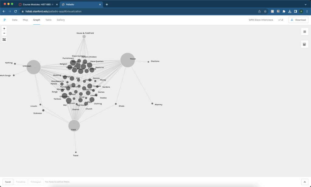
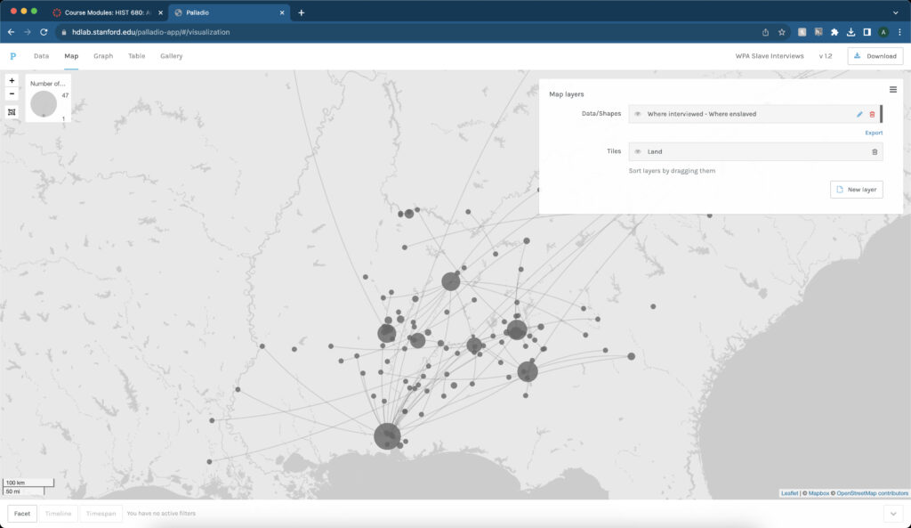
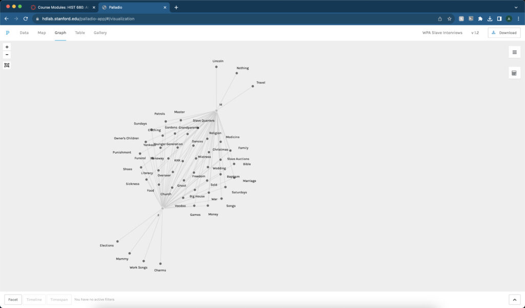
Similar to Kepler.gl, Palladio can also make use of maps in a digital medium. However, the tool’s main component is using network graphs to show the relationships between different data. These graphs, overlaid on a map, can show the connections across space. Nonetheless, some of the most helpful information comes from looking at the network graphs themselves and limiting which data is present. Limiting the data can show different connections that otherwise go unseen in traditional research or are harder to see. For example, when I worked with Palladio, I limited the information to only look at topics discussed between male and female interviewees. While both groups shared similar topics, some were limited to a particular group. These topics tell me a lot about the subjects themselves and the culture at the time of their interviews.

While these three tools have different modes of executions, researchers should look at them in a variety of ways. Researchers can use these tools together to find meaning, patterns, and trends with the material and data they choose to research. While Palladio can use maps with the network graphs, it only shows a certain amount of information. A researcher should also include using Kepler.gl to get the information one can get from using a map that otherwise Palladio lacks. At the same time, Palladio also relies heavily on using words especially in the network graphs. Voyant makes the perfect complement to that program to delve deeper into using those words in the data.

Network Analysis with Palladio

Network graphs are helpful tools that researchers can use to convey meaning between information connections. According to authors Ruth Ahnert, Sebastian E. Ahnert, Catherine Nicole Coleman, and Scott B. Weingart, in their book The Network Turn: Changing Perspectives in the Humanities (2020), “The conventional network graph of node and edge (points connected by lines) makes it possible to convey a tremendous amount of information all at once, in one view. Networks express an internal logic of relationships between entities that is inherently intuitive.” (The Network Turn 57). The connections shown through these graphs can give researchers information about the material they are studying.

Many projects have used network graphs to help better understand, gain meaning, and answer questions about the material they are graphing. One such project includes Viral Texts. In this project, researchers, including Ryan Cordell, examined nineteenth-century American newspapers and their connections. What they found with these newspapers recirculated many articles, making the researchers wonder why. They found the answers to many of the different questions posed by the different types of recirculated texts related to the culture during the Antebellum period in the United States. Mapping the Republic of Letters is another project that used network graphs similar to Viral Texts. Like in the Viral Texts project, the Mapping the Republic of Letters project used network graphs overlaid on a map to show connections between letters from historical figures. From these connections and the use of a map, researchers discovered the importance of travel and that the letters were a way “of communicating ideas and shaping opinion, and also as a process of intellectual self-definition.” (“Historical Research in a Digital Age” 407-9). Another project that uses network graphs is Linked Jazz. Linked Jazz, like the other two projects, uses these graphs to show connections with the researchers’ material, in this case different jazz musicians. What the researchers discovered was “data about concert performances and recording dates gives . . . rich information about not just collaborations between musicians, but also about time and place, musical works, songs, and songwriters, and record labels and releases . . . .” (Hwang, Levay, and Provo “Contributing to Linked Jazz” 2015). Network graphs can show the connections between material and convey meaning about a time, place, people, or even a genre of music.

I discovered much information and meaning from using these tools when starting with Palladio and network graphs. A simple network graph overlaid on a map shows the connections across the space. It gave me a scope of how and where these connections happened.

I then started playing around with the network graphs and limiting certain information to see what I could find. One such graph shows the topics that male and female interviewees discussed. While they shared many of the topics, some were limited to either only male or only female interviewees. Using that information, I gathered that those topics were important to that gender specifically for a reason. For example, only female interviewees discussed elections which made me think about how they did not get the right to vote like their male counterparts which is probably why that topic is important to them.

Another graph shows the topics categorized based on their job. Again the topic of elections stood out to me since it was limited to only people who worked in the house. It led me to think that perhaps it was because they heard more gossip and politics from their masters while working in the house.

Mapping with Kepler.gl

Mapping in the Digital Humanities is a valuable tool for researchers to look for patterns and trends across space. Todd Presner and David Shepard, in their article Mapping the Geospatial Turn (2016), state, “On its most basic level, a map is a kind of visualization that uses levels of abstraction, scale, coordinate systems, perspective, symbology, and other forms of representation to convey a set of relations.” (Presner and Shepard 247). Researchers can use those patterns and trends to gather meaning and understanding about the material they are researching. There are different ways that researchers use these maps to find patterns and form meanings, including “historical mapping of ‘time-layers’ to memory maps, linguistic and cultural mapping, conceptual mapping, community-based mapping, and forms of counter-mapping that attempt to de-ontologize cartography and imagine new worlds.” (Presner and Shepard 247).

There have been many projects that have used maps to find trends and show meaning in the material that they present. One such project is the Photogrammar project. The Photogrammar project, created and updated from 2012 to 2016, is a website showcasing photographs from the FSA-OWI archive. The program “began as a response to the challenges of navigating the digital and physical archive at the LoC [Library of Congress]” (Arnold 2). The project uses what they call “generous interfaces” to help gather meaning using different modes of visualization. (Arnold 3). Another project that uses maps is the Histories of the National Mall. This project is a website that uses Google Maps to place markers around the National Mall in Washington, D.C. These markers are important buildings, statues, monuments, and areas that hold historical significance in the city and country. Sheila Brennan states, “Our key strategy for making the history of the National Mall engaging for tourists was to populate the website with surprising and compelling stories and primary sources that together build a textured historical context for the space and how it has changed over time.” (Brennan). Mapping the Gay Guides is another project that uses maps to find trends and patterns in their material. The project uses a popular, life-saving book called Bob Damron’s Address Book to place markers on a map of all the bars mentioned in that book to find those trends and patterns. Some of the different topics explored in the project tackle race, gender, and sexuality with each topic containing trends and meanings from the material and map. (Regan and Gonzaba).

When using maps with the Kepler model I was surprised with what I could discover from the material. I have only used maps once before in my projects, and they were simple Google Maps, like with the Histories of the National Mall, and I only did a little analysis with them. Working with Kepler changed my perspective on using maps for research. Even a simple point map can show information about relationships between the different points. However, there is so much more a map can do. This includes cluster and heat maps which can show quantity and density which a point map lacks. A timeline can be added to a map to show how that area and material changed over time. There is much more that a map can show that can give a researcher more information about the material they have presented.

Text Analysis with Voyant

Text-Mining are different tools historians and researchers use to gather meaning from a set of information or data. Lincoln A Mullen from America’s Public Bible project states, “The project uses the techniques of machine learning and text analysis to find the quotations, and it uses data analysis and visualization to make sense of them.” (2) Text mining allows analysis of a set of data to gather meaning from it. The types of information a researcher can use can vary. In the case of America’s Public Bible and the Signs@40 projects, researchers use written sources in the form of newspapers and articles, respectively, to gather their information. However, it does not always have to be just written sources. In the case of the Robots Reading Vogue project at Yale University, researchers used visual sources in the form of magazine covers along with written sources to accumulate data. From the data collected, researchers then ask questions and gather meaning from that data. Researchers usually try to find trends and patterns in the data and then gather meaning from those. Historians might want to understand the period or events associated with the information presented, so they would look for any trends or patterns in their collected data to find answers.

Voyant is an excellent text mining tool for historians and researchers to help researchers find those trends and patterns. Researchers can put information into the free online tool and investigate the data using the five tools provided. The five tools work together as a corpus, making it easy for researchers to find the trends and patterns in the information they provide.

When using the tool, I used data from the WPA Slave Narratives collection. When looking at the data on Voyant, I wanted to compare different states and look at the similarities and differences between them. I decided to look at Georgia and Virginia and their most used words with their respective word clouds. Looking at Georgia’s word cloud, I noticed that there were a variety of stereotypical southern words, including plantation, marster, and slaves. The most used word, however, was old.

In comparison, Virginia’s word cloud contained more dialect words, including ah, yo, tuh, and yer. However, the most used word was slaves.

When looking at the articles concerning the word clouds, Virginia focused more on dialect with enslaved people, while Georgia’s was more about life in the South.

Why Metadata Matters

Metadata is considered “data about data” (Carbajal and Caswell). According to the Jisc article, metadata “is usually structured textual information that describes something about the creation, content, or context of a digital resource—be it a single file, part of a single file, or a collection of many files.” (Jisc) Metadata describes every part of an image. It is essential in the field of digital humanities. If there is a picture of an object but no information attached to that object, people would not be able to use that digital item. Not only that, but the item would not be discoverable (DPLA). For example, with my kitchen item, if I did not add any metadata to those images, other people would not be able to search and use them.

Several different metadata categories are essential in the realm of digital humanities. The first category is the description of an item. The Carbajal and Caswell article states, “For archivists, preservation and description are key ingredients in making a collection of records ‘archival.’” (Carbajal and Caswell). A digital item should have a thorough description so that a person will know what that item is. If I did not put a description on my kitchen items, people would not know what the image is. Two other metadata categories are equally essential and coincide: creator and rights. People can find all kinds of digital images. However, one must know how to find the rights to those digital images. For example, I cannot just find an image on the internet and decide to use it; however, I want to use it. I need to make sure there is no copyright claim on the image. This goes right into the creator element. With rights, there is the correlated element of the creator. Some rights claims require people to ask the original creator for permission to use the image, so it is essential to include the creator when creating metadata.

Tropy is an excellent way to help digital humanities practitioners work with metadata. Tropy is a program that people can use to help input and describe sources using metadata. I found it helpful and easy to use in the kitchen items assignment. Tropy made it extremely easy to input the pictures and describe the images using metadata. Omeka is another program that can help digital humanities practitioners work with metadata, especially combined with Tropy. Omeka is a web platform where people can create digital exhibits. While using Tropy, researchers can export and import their data into Omeka. After that, they can then create exhibits using that data. I could do that with the items I exported from Tropy and then imported into Omeka. I could add information, change the layout, and add pictures of the kitchen items.